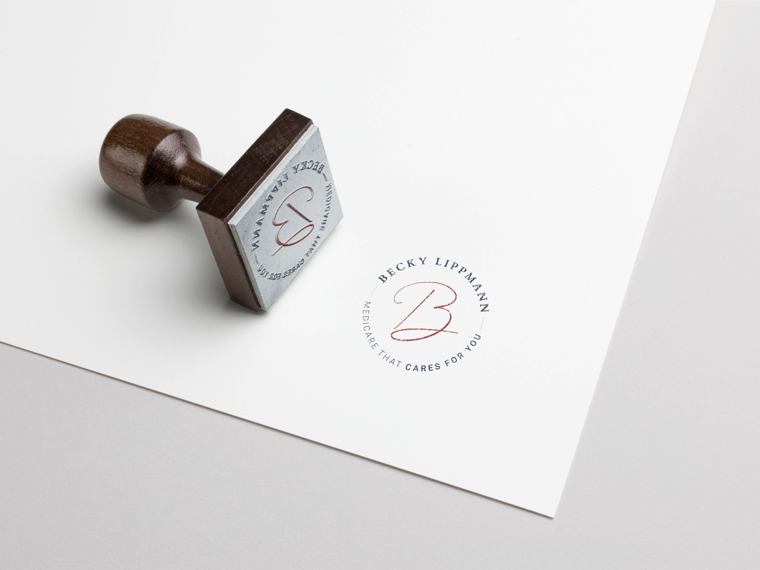

Becky Lippmann
With paramount service and a name in the community, Becky Lippmann sought to expand her reach through thoughtful brand representation. It was her aim to take a “less-is-more” approach and let her service speak for itself. With this in mind, we limited our efforts to develop a clean, flexible logo suite that proclaims her values.
-
Produce a minimalist logo suite to represent communication, sincerity, and guidance, three hallmarks of Lippmann’s client relationships.
-
To match the core values with her time-honoring and personal approach to business, a gentle patriotic color scheme was used. The typographic treatment includes three fonts. Together they embody strength, kindness, and professionalism. The layout as a whole was structured to engage the viewer while also feeling approachable and comforting.
-
Logo Suite
Color Palette
Typography Consideration